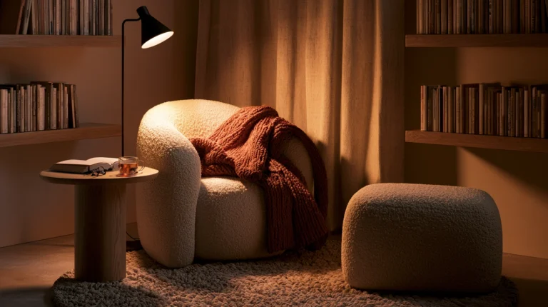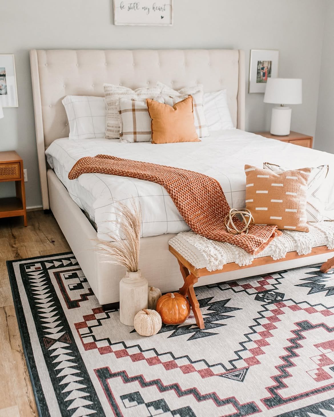
14 Moody Fall Bedroom Color Palettes
My bedroom was builder-beige for six years before I touched a single paint can.
Every fall I’d buy a new throw blanket or candle trying to chase that cozy, moody feeling, and every fall the room still looked exactly the same underneath it all.
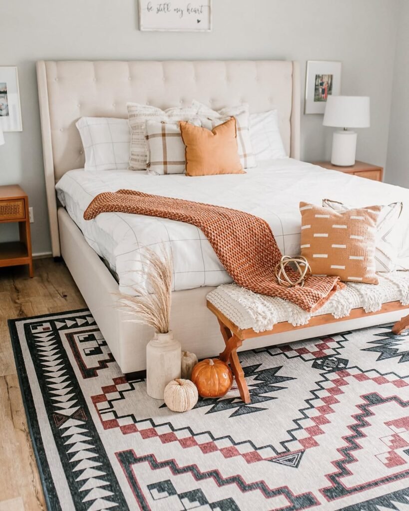
Last October I finally admitted the problem wasn’t the accessories. It was the walls.
I painted one accent wall in a deep clay tone on a Saturday afternoon, and the whole room finally felt like the fall bedroom I’d been trying to fake for years.
Since then I’ve tested color combinations in my own house and helped friends pick theirs, and these 14 palettes are the ones that actually deliver that moody, layered fall feeling without making a room feel dark or small.
What Makes a Palette Read as “Moody” Instead of Just Dark
A lot of people confuse moody with dark, then end up with a bedroom that feels like a cave instead of a retreat.
- Moody palettes lean on deep, saturated colors rather than flat black or gray
- They almost always include at least one warm undertone, like clay, rust, or brown, to keep the room feeling inviting
- Texture does as much work as color, since a matte deep wall paired with warm wood reads differently than the same color with glossy white trim
- Lighting matters more in moody rooms, since warm bulbs support the palette while cool white bulbs fight against it
- The best moody rooms still have one lighter element, whether that’s bedding, trim, or a rug, to keep the space from feeling flat
Keep these five ideas in mind as you look through the palettes below, since the same color can look completely different depending on how it’s balanced.
1. Terracotta and Charcoal
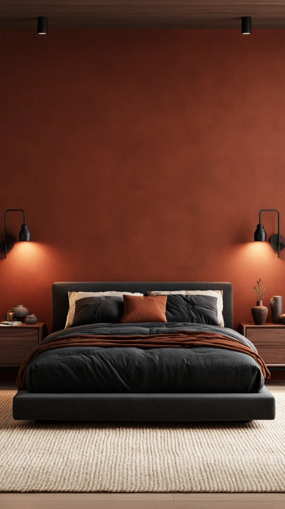
This pairing feels like a desert at dusk, warm clay balanced against something much deeper.
- Wall color: A muted terracotta or burnt clay, matte finish
- Accent tones: Charcoal bedding, black metal light fixtures
- Wood tones: Warm walnut or reclaimed oak
- Best for: South-facing rooms that get strong natural light, since the terracotta softens harsh sun
- Watch out for: Pairing with cool gray undertones instead of charcoal, which fights the warmth of the terracotta
2. Deep Forest Green and Cream
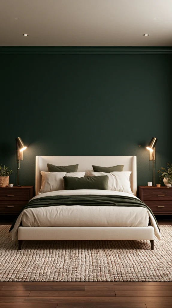
Green this deep reads as moody and grounded rather than bright or springlike.
- Wall color: A near-black forest green, matte or eggshell finish
- Accent tones: Cream or ivory bedding, brass hardware
- Wood tones: Dark walnut or ebonized oak
- Best for: Bedrooms with large windows, since the cream keeps the deep green from swallowing the light
- Watch out for: Pure white accents instead of cream, which can feel too crisp and cold against this particular green
3. Rust and Warm Gray
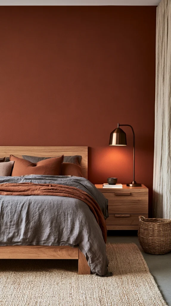
Rust brings the warmth, warm gray keeps it from tipping into an overly rustic look.
- Wall color: A dusty rust or burnt sienna, matte finish
- Accent tones: Warm greige bedding, oil-rubbed bronze fixtures
- Wood tones: Medium oak or ash
- Best for: Smaller bedrooms, since rust reads as cozy rather than cramped even in tight square footage
- Watch out for: Cool-toned grays, which can make the rust look muddy instead of rich
4. Espresso Brown and Blush
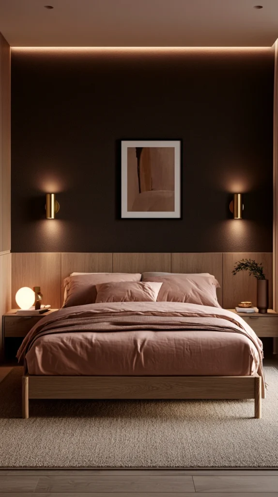
An unexpected pairing that feels surprisingly soft once it’s balanced correctly.
- Wall color: A deep espresso brown, matte finish, often used as an accent wall rather than all four walls
- Accent tones: Dusty blush bedding, soft pink or brass accessories
- Wood tones: Light natural oak to balance the dark wall
- Best for: Bedrooms wanting a moody feel that still reads as soft and romantic
- Watch out for: Bright, cool pinks, which clash rather than complement the warmth of espresso brown
5. Deep Plum and Slate
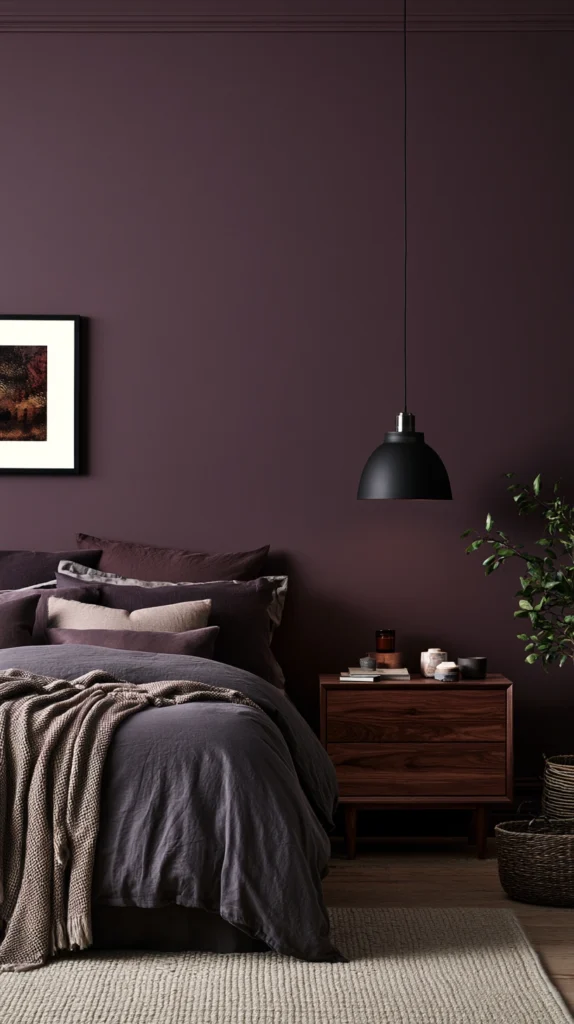
Plum brings richness without going as dark or heavy as black or charcoal.
- Wall color: A deep plum or aubergine, eggshell finish
- Accent tones: Slate gray bedding, matte black fixtures
- Wood tones: Dark walnut
- Best for: North-facing rooms that need a little more visual warmth than a true gray or black palette provides
- Watch out for: Overly cool undertone plums, which can shift the whole room toward feeling cold rather than moody
6. Mustard and Espresso
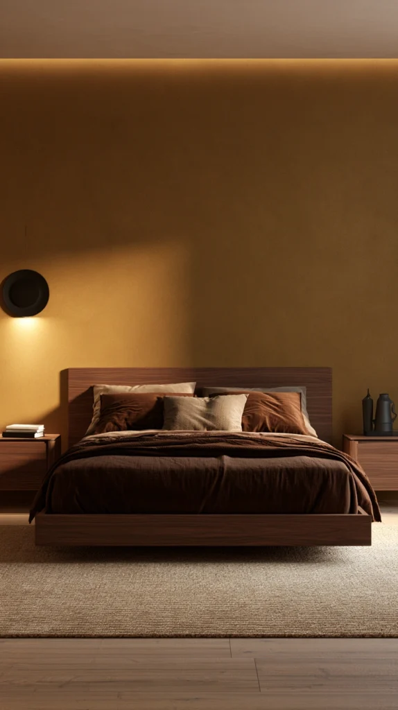
Mustard is a bold choice, but paired with deep brown it reads as autumn rather than retro.
- Wall color: A muted mustard or ochre, used as an accent wall
- Accent tones: Espresso bedding or brown leather accents
- Wood tones: Warm walnut
- Best for: Bedrooms with a lot of natural light that can handle a bold, saturated wall color
- Watch out for: Using mustard on all four walls, which can quickly feel overwhelming rather than cozy
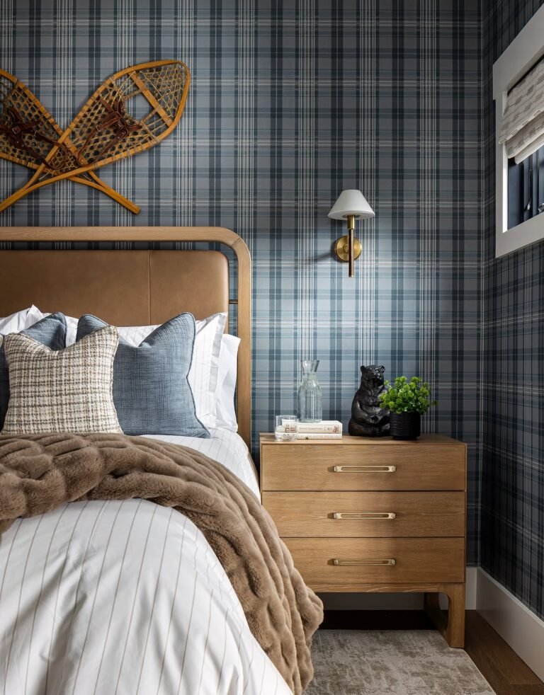
7. Deep Navy and Warm Camel
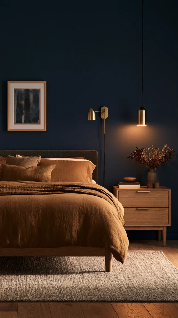
Navy is often treated as a cool color, but paired with camel it shifts into distinctly fall territory.
- Wall color: A deep, almost-black navy, matte finish
- Accent tones: Warm camel or tan bedding, brass fixtures
- Wood tones: Medium warm oak
- Best for: Bedrooms wanting a moody, masculine-leaning palette without leaning into browns or rust
- Watch out for: Cool gray or silver accents, which pull the navy back toward a cold, wintery feel instead of fall
8. Burgundy and Cream
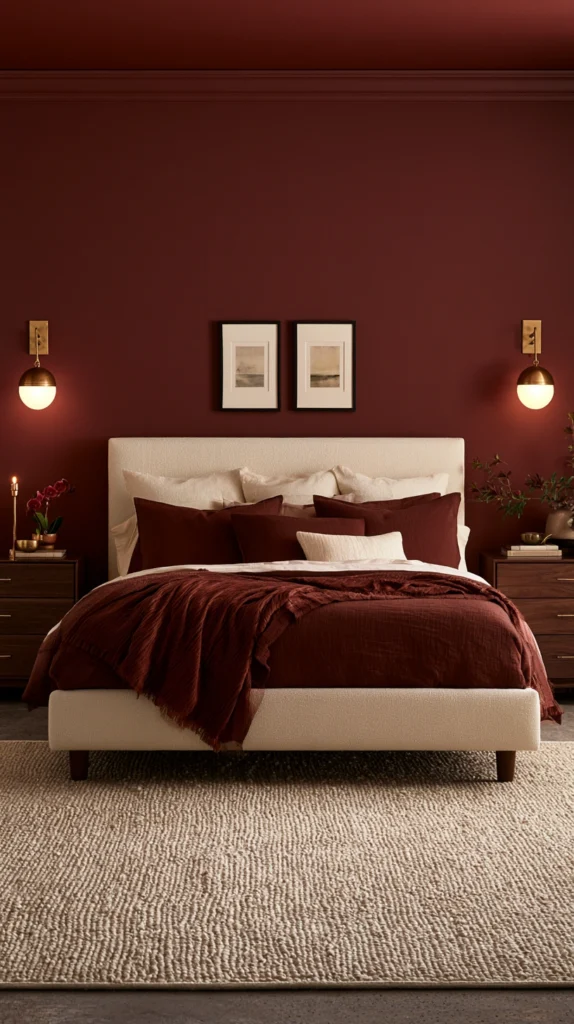
Burgundy is one of the most classically “fall” colors, and it reads as elegant rather than heavy when balanced well.
- Wall color: A deep burgundy or oxblood, eggshell finish
- Accent tones: Cream bedding, aged brass or gold fixtures
- Wood tones: Dark cherry or walnut
- Best for: Primary bedrooms wanting a more formal, elevated moody look
- Watch out for: Bright white instead of cream, which can make the burgundy feel more like a holiday color than a fall one
9. Olive and Warm Taupe
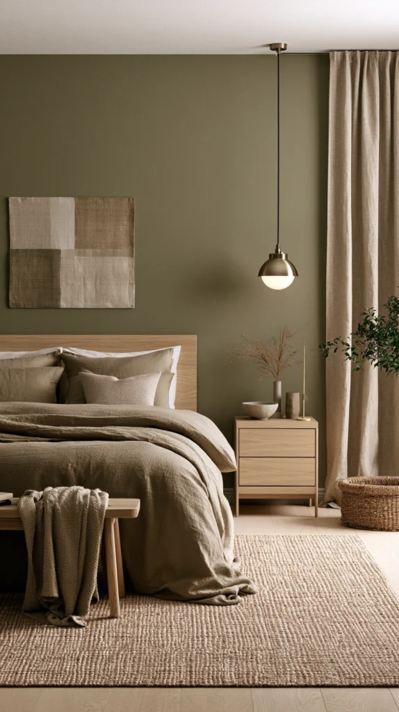
Olive is quieter than forest green, which makes it easier to live with as an all-over wall color.
- Wall color: A muted olive, matte finish, works well on all four walls
- Accent tones: Warm taupe bedding, natural linen textures
- Wood tones: Light to medium oak
- Best for: Bedrooms wanting a moody feel that still stays fairly neutral and easy to update later
- Watch out for: Cool beige instead of warm taupe, which can flatten the richness of the olive
10. Chocolate Brown and Sage
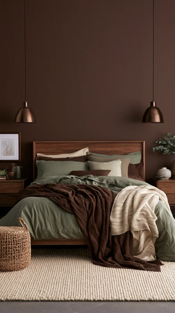
An earthy pairing that feels grounded and calm rather than dramatic.
- Wall color: A deep chocolate brown, matte finish, often paired with sage on trim or an accent wall
- Accent tones: Sage green bedding, natural rattan or wood accessories
- Wood tones: Warm medium oak
- Best for: Bedrooms aiming for a nature-inspired moody look rather than a dramatic or bold one
- Watch out for: Bright, cool sage tones, which can clash with the warmth of chocolate brown rather than complement it
11. Black and Warm Wood
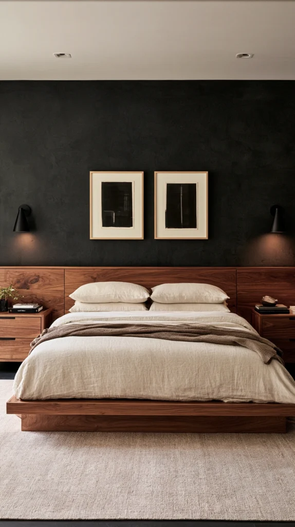
The boldest option on this list, but far cozier in person than it sounds on paper.
- Wall color: A true matte black or near-black charcoal, often as a single accent wall
- Accent tones: Warm cream or oatmeal bedding to balance the depth
- Wood tones: Warm walnut or teak, used generously in furniture and accessories
- Best for: Bedrooms with good natural light or strong artificial lighting, since black absorbs light more than any other color on this list
- Watch out for: Pairing with cool white bedding, which creates a stark, cold contrast instead of a warm, moody one
12. Cinnamon and Cream
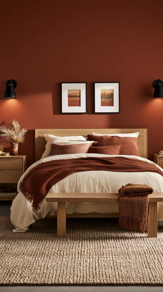
A softer, more approachable take on the terracotta and clay family of tones.
- Wall color: A warm cinnamon or spiced clay, matte finish
- Accent tones: Cream bedding, woven textures like jute or wool
- Wood tones: Light to medium oak
- Best for: Bedrooms wanting a moody feel without committing to a particularly dark wall color
- Watch out for: Pairing with cool gray textiles, which pull the warmth out of the cinnamon tone
13. Deep Teal and Copper
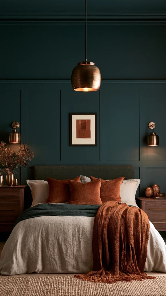
Teal reads as unexpected in a fall palette, but paired with copper it shifts warm and rich.
- Wall color: A deep, muted teal, eggshell finish
- Accent tones: Copper or warm bronze fixtures and accessories
- Wood tones: Dark walnut
- Best for: Bedrooms wanting a moody palette with a bit more personality than the more common brown and rust tones
- Watch out for: Bright, saturated teal, which reads more coastal than fall unless muted down significantly
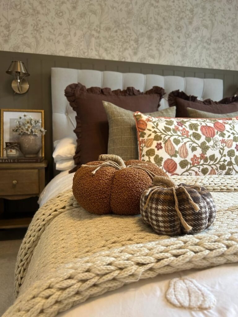
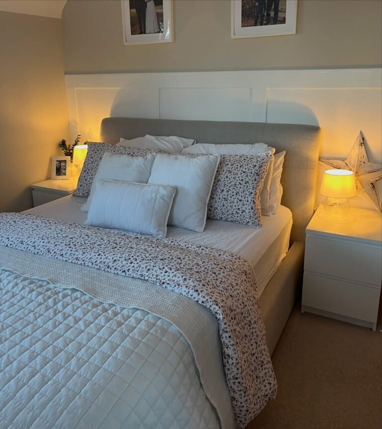
14. Warm Gray and Rust Accents
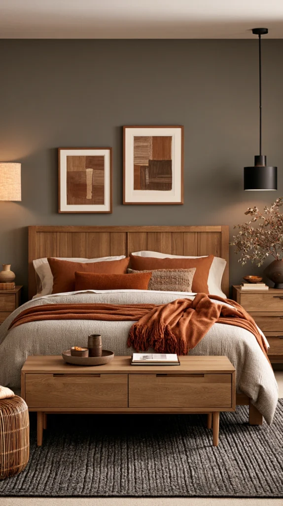
For anyone hesitant to commit to a full dark wall, this palette delivers the mood through accents instead.
- Wall color: A warm mid-tone gray, keeping the base of the room lighter and more flexible
- Accent tones: Rust or burnt orange bedding, pillows, and throws
- Wood tones: Medium warm oak
- Best for: Renters or anyone who wants a moody fall feel without repainting at all
- Watch out for: Cool-toned gray paint, which needs the rust accents to work twice as hard to feel warm and cohesive
Picking the Right Palette for Your Room’s Light
Before you settle on a color, think about how much natural light your bedroom actually gets throughout the day.
- Rooms with strong natural light can handle the darkest, boldest palettes on this list, like black and warm wood or deep navy and camel
- Rooms with limited natural light do better with warmer, mid-depth tones, like cinnamon and cream or warm gray with rust accents
- North-facing rooms benefit from palettes with a strong warm undertone, since the natural light itself already leans cool
- Always test a sample swatch on the wall at different times of day before committing to a full gallon of paint
Where to Start If You’re Not Ready to Commit
If painting a full room feels like too big a first step, start with a single accent wall behind the headboard using any palette above.
Layer in the accent tones through bedding and a throw blanket first, and see how the room feels for a full week before deciding on paint.
Once you know which undertone you’re drawn to, warm or cool, deep or muted, the rest of the palette choices get a lot easier to narrow down.