15 Fall Color Palettes for a Moody Bedroom Makeover
My bedroom stayed pale gray and white through eight years of falls. Same flat walls, same bright bedding, same room whether the leaves were turning or the snow was melting.
Tried adding one burgundy pillow once. Sat on a white duvet against gray walls looking like a mistake, not a mood. Removed it within a week.
Then I stopped adding single colors and started building complete moody palettes — wall, bedding, and light all working together toward one dark, warm feeling. The bedroom finally became a place that felt different after sunset than it did at noon, and different in October than in June.
Now I fall asleep in a room that feels like it is holding me rather than just containing me. Same bones, same windows, completely different atmosphere.
Let me show you 15 color palettes that turn a pale, seasonless bedroom into a moody fall retreat.
Why Pale Bedrooms Resist Becoming Cozy
The brightness problem:
What pale rooms do:
- Bounce and amplify whatever light enters
- Read as clean and airy, never as enveloping
- Show every shadow as a flaw to be lit away
- Resist the psychological quality of a den or retreat
Why moody is different:
The absorption principle:
- Dark, saturated walls absorb light rather than reflecting it
- Absorbed light creates depth, shadow, and intimacy
- A moody room feels smaller in the most comforting sense, like a held space
- This is the exact opposite design goal from a bright, expansive room, and bedrooms benefit from the opposite goal
Why one accent color never achieves this:
The system requirement:
- A single colored pillow or throw against pale walls still reads as a bright room with one dark object in it
- A true moody palette changes the walls, the bedding, and the light together
- Without the walls participating, no amount of dark textiles will shift the room’s fundamental temperature
- This is why isolated color additions consistently fail to create the desired mood
My revelation: A moody fall bedroom is a complete palette, not a dark accessory in an otherwise pale room. Walls, bedding, and light all need to agree before the mood actually arrives.
1. Hunter Green and Aged Brass (The Library Bedroom)
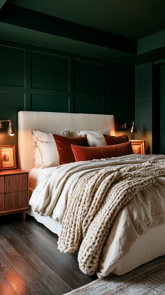
Deep blue-green walls with warm brass metal accents — the palette that turns a bedroom into a private reading sanctuary.
Why hunter green works for bedrooms specifically:
The psychological association:
- Deep green is consistently rated as one of the most calming wall colors in design research
- Hunter green specifically (darker, more blue-toned than forest or olive) reads as sophisticated rather than rustic
- The color recalls leather-bound libraries and old wood-paneled studies
- This association makes the bedroom feel intellectual and restful simultaneously
Best hunter green paints:
Wall color options:
- Benjamin Moore Hunter Green (2041-10) — the most direct reference paint
- Farrow and Ball Studio Green (No. 93) — slightly more sophisticated, very popular currently
- Sherwin-Williams Rookwood Dark Green (SW 2809) — deep and rich
- Behr Secret Garden — affordable and accessible
Wall application:
Full commitment versus partial:
- All four walls in hunter green creates the most complete enveloping effect
- Headboard wall only is a lower-commitment starting point
- Ceiling in the same color (or one shade lighter) completes the cocoon effect most dramatically
Brass as the metal of choice:
Why brass specifically:
- Brass has a warm golden undertone that activates against deep green beautifully
- Unlacquered brass develops a soft patina over time, deepening the aged library feeling
- Avoid chrome, brushed nickel, or any cool-toned metal in this palette; the contrast fights the warmth
Where brass appears:
- Bedside lamp bases
- Picture frame finishes
- Drawer pulls and cabinet hardware
- A brass floor lamp beside a reading chair
Bedding for the hunter green palette:
Color choices:
- Warm cream or ivory sheets and duvet (the essential lightening counterpoint)
- A deep cognac leather or velvet accent pillow
- A camel or oat chunky knit throw at the foot
Lighting:
Completing the library mood:
- Warm amber bulbs throughout (2200-2700K, as established in fall bedroom lighting principles)
- A brass reading lamp beside any seating
- Avoid overhead lighting entirely once the walls are dark; rely on lamps
Cost:
- Paint (full room): $80-150
- Brass accents (lamp, frames, hardware): $80-200
- Bedding additions: $100-250
- Total: $260-600
My hunter green bedroom: Painting all four walls in Farrow and Ball Studio Green and adding brass lamps on both nightstands turned the room into the most restful space in the house, the green absorbs light in a way that makes even midday feel calm.
Hunter Green Tips
Test the undertone:
Before committing:
- Hunter green can lean either blue-green (cooler) or yellow-green (warmer)
- Paint a large sample and observe in both daylight and lamp light
- The warmer undertone pairs more easily with brass and cream; the cooler undertone needs more warm light compensation
Ceiling consideration:
The full envelope:
- A white ceiling against hunter green walls can feel like the room has no top
- Painting the ceiling the same color, or a closely related lighter green, completes the cocoon effect significantly
2. Burgundy and Cream (The Romantic Wine Cellar)
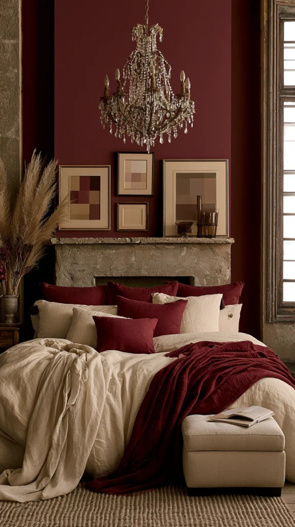
Deep wine-red walls with soft ivory textiles — the most overtly romantic and atmospheric of the moody fall palettes.
Why burgundy reads as fall and not Christmas:
The undertone distinction:
- True red (with a blue undertone) reads as Christmas immediately
- Burgundy (red plus brown plus a touch of purple) reads as wine, harvest, and autumn evening
- The darkness and brown undertone is what separates this from a holiday palette entirely
Best burgundy paints:
Wall color options:
- Sherwin-Williams Merlot (SW 6307)
- Benjamin Moore Dark Burgundy (2086-10)
- Farrow and Ball Preference Red (No. 297) — more muted and sophisticated
- Behr Vintage Wine
Application approach:
Where burgundy works best:
- A single accent wall (often the headboard wall) for a lower-commitment introduction
- All four walls for the most immersive, jewel-box bedroom
- This is one of the more dramatic palettes on this list, and most people find one wall sufficiently transformative
Cream as the essential counterpoint:
Why cream over white:
- White against burgundy reads stark and almost clinical
- Cream or ivory softens the contrast and keeps the warmth consistent
- The cream should lean warm (yellow undertone), never cool or blue-toned
Bedding for this palette:
Building the romantic atmosphere:
- Ivory or cream linen sheets and duvet cover
- Burgundy velvet throw pillows (two to three)
- A blush or dusty rose accent pillow for softness
- Gold or rose gold metal accents (warmer than brass, slightly more romantic)
Candlelight specifically:
Why this palette demands candles:
- Burgundy walls under candlelight develop a depth and glow that no other lighting fully replicates
- LED candles are the safe choice for bedroom use, clustered on the dresser or nightstand
- This palette is specifically designed to be experienced in the evening, more than any other on this list
Cost:
- Paint (one accent wall): $30-60
- Paint (full room): $80-150
- Cream bedding: $100-250
- Burgundy and blush accent pillows: $60-110
- Total: $190-510
My burgundy bedroom result: Painting just the headboard wall in Sherwin-Williams Merlot and adding ivory linen bedding with two burgundy velvet pillows created the most atmospheric corner of the entire house, particularly stunning by candlelight in the evening.
Burgundy and Cream Tips
The blush bridge:
Adding a third tone:
- A small amount of blush or dusty rose between the burgundy and cream prevents the palette from feeling too heavy
- One blush pillow or a blush-toned lamp shade is often sufficient
- This third tone softens what could otherwise feel like an overly serious or formal palette
Avoiding the Christmas association:
What to skip:
- Gold and burgundy together can edge toward holiday decor if not handled carefully
- Favor brass or rose gold over bright gold
- Keep greenery minimal or absent in this specific palette to avoid the seasonal confusion
3. Charcoal and Warm Caramel (Modern Moody Minimalism)
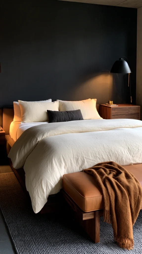
Deep warm gray walls with rich caramel leather and wood tones — the most contemporary interpretation of a moody fall bedroom.
Why charcoal over black:
The livability factor:
- Pure black walls can feel oppressive and difficult to live with long-term
- Charcoal (a very dark, warm-leaning gray) achieves nearly the same drama with more flexibility
- Charcoal also photographs and reads better under varied lighting than true black
Best charcoal paints:
Wall color options:
- Benjamin Moore Kendall Charcoal (HC-166)
- Sherwin-Williams Urbane Bronze (SW 7048) — has a warm undertone, very popular
- Farrow and Ball Down Pipe (No. 26) — slightly blue-warm, sophisticated
- Behr Cracked Pepper
The warm undertone requirement:
Why undertone matters more here than anywhere else:
- A cool-toned charcoal (blue-gray) paired with caramel clashes noticeably
- A warm-toned charcoal (brown-gray) harmonizes with caramel naturally
- This is the single most important verification step before painting this specific palette
Caramel as the warming element:
Where caramel appears:
- Leather headboard or leather bench at the foot of the bed
- Caramel or cognac leather pillow accent
- Warm wood furniture (walnut, cognac-stained oak)
- A caramel wool or boucle throw blanket
The modern minimalist application:
Keeping it contemporary:
- Fewer objects than the more maximalist palettes on this list
- Clean-lined furniture rather than ornate or vintage pieces
- One or two excellent leather or wood pieces rather than many small accents
- Negative space is part of this specific palette’s identity, unlike the abundant layering of other moody palettes
Lighting for charcoal and caramel:
The modern approach:
- Sculptural brass or matte black lamp bases (either works in this more contemporary palette)
- Warm bulbs throughout, but a slightly cleaner, less cluttered lighting scheme than the more traditional palettes
- A single statement floor lamp can replace multiple smaller lamps in this minimalist approach
Cost:
- Paint (full room): $80-150
- Leather accent piece (bench or pillow): $60-300
- Caramel throw and minimal accents: $60-120
- Total: $200-570
My charcoal and caramel bedroom: Sherwin-Williams Urbane Bronze on all four walls with a single cognac leather bench at the foot of the bed created a moody bedroom that still felt clean and modern rather than heavy or cluttered, proving moody does not require maximalism.
Charcoal and Caramel Tips
The undertone test before anything else:
Verification step:
- Hold a caramel leather swatch or fabric sample against the charcoal paint chip
- Warm charcoal plus caramel: visible harmony
- Cool charcoal plus caramel: visible clash
- This thirty-second test prevents the most common mistake with this specific palette
Restraint as the design principle:
Resisting over-decoration:
- This palette specifically rewards fewer, better objects
- Resist the instinct to add layers of pillows and throws as seen in other palettes
- One excellent leather piece does more work here than five smaller textile additions
4. Deep Plum and Warm Gold (Unexpected Jewel Tone Luxury)
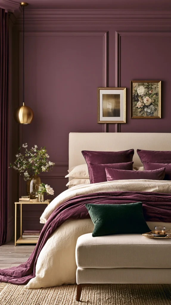
Dusty muted purple walls with warm metallic gold accents — the most surprising and distinctive palette on this list.
Why plum is underused and underrated:
The hesitation most people feel:
- Purple in general is often associated with childhood bedrooms or overly saturated, immature color choices
- Muted, dusty plum is an entirely different color story: sophisticated, adult, and genuinely rare in bedroom design
- This rarity is exactly what makes it distinctive
Best plum paints:
Wall color options:
- Farrow and Ball Brassica (No. 271) — the most referenced muted plum in design circles
- Benjamin Moore Twilight (2070-30)
- Behr Elderberry
- Clare Paint Eggplant — deeper and richer
The muted requirement:
Avoiding the childish version:
- Bright or saturated purple reads as playful, not moody
- A dusty, grayed-down plum reads as sophisticated
- Always choose the muted version of any purple paint when building this palette
Gold as the metal choice:
Why gold over brass here specifically:
- Plum’s slight red undertone pairs especially well with warm gold (more yellow than brass’s slightly orange tone)
- Aged or antiqued gold rather than bright polished gold maintains the moody, sophisticated feeling
- Gold-framed mirrors and gold candle holders work particularly well
Bedding for the plum palette:
Building the full look:
- Warm cream or ivory base bedding (essential, as with the other dark palettes)
- One or two plum velvet accent pillows
- A small amount of forest green as a third color (an unexpected but beautiful addition to plum)
The forest green addition:
Why this combination works:
- Plum and forest green share a similar depth and muted quality
- Together they read as rich, autumnal, and slightly gothic without veering into Halloween territory
- A single green velvet pillow against the plum and cream base completes a genuinely distinctive palette
Cost:
- Paint (full room): $80-150
- Gold accents (mirror, candle holders): $50-150
- Plum and forest green velvet pillows: $60-110
- Total: $190-410
My plum and gold bedroom result: This was the palette nobody expected and everybody asked about, the muted Brassica purple with an antiqued gold mirror and one forest green pillow created something genuinely unlike any other bedroom I had seen, distinctive without trying too hard to be different.
Plum and Gold Tips
The muted test:
Checking saturation before buying:
- Hold the paint chip at arm’s length and squint slightly
- If the color still reads as clearly “purple” rather than a muted neutral, it may be too saturated for this sophisticated application
- The correct plum should almost read as a dark warm gray from a distance, with the purple only becoming apparent up close
Pairing plum with existing furniture:
Practical consideration:
- This palette works particularly well with existing dark wood furniture (walnut, mahogany)
- Less successful with very light or blonde wood pieces, which can clash with plum’s depth
- Consider existing furniture tone before committing to this specific wall color
5. Terracotta and Charcoal (Earthy Drama)
Warm clay-orange walls paired with deep charcoal textiles — the palette that brings outdoor earth tones into a dramatically dark interior.
Why terracotta and charcoal specifically:
The contrast principle:
- Most moody palettes pair a dark wall with light bedding
- This palette inverts that expectation: a warm mid-tone wall with dark, dramatic bedding
- The result feels grounded and earthy rather than purely jewel-box dramatic
Best terracotta paints:
Wall color options:
- Sherwin-Williams Cavern Clay (SW 7701)
- Benjamin Moore Moroccan Spice (2171-30)
- Farrow and Ball Red Earth (No. 64)
- Behr Canyon Dusk
Why terracotta reads as moody despite being a mid-tone:
The depth factor:
- True terracotta has enough brown and red depth to feel substantial rather than bright
- Unlike a true orange (which feels energetic), terracotta feels grounded and warm
- Paired with dark accents, the overall room still achieves a moody atmosphere despite the wall not being a true dark color
Charcoal bedding and textiles:
Building the contrast:
- Charcoal linen or cotton duvet cover
- Charcoal velvet throw pillows against the warm wall
- A charcoal wool blanket folded at the foot
Why this inverted approach works:
The visual logic:
- The eye reads the dark bedding as the most prominent element in the room
- The terracotta wall provides warmth and depth as a backdrop rather than competing for attention
- This creates a different kind of moodiness: grounded and earthy rather than enveloping and dark on every surface
Metal and wood accents:
Completing the earthy palette:
- Aged bronze or dark iron metal finishes (rather than bright brass)
- Warm dark wood furniture (walnut or dark oak)
- Terracotta ceramic objects (vases, lamp bases) that echo the wall color
Cost:
- Paint (full room): $80-150
- Charcoal bedding: $90-220
- Bronze or iron accents: $40-100
- Total: $210-470
My terracotta and charcoal bedroom: This was the palette that finally made sense of why I loved both warm earthy colors and dramatic dark bedding without realizing they could coexist, the Cavern Clay walls feel like the inside of a clay vessel while the charcoal bedding adds the moody weight I wanted.
Terracotta and Charcoal Tips
The proportion balance:
Getting the ratio right:
- The walls should remain the dominant warm element
- Charcoal should appear primarily in bedding and a few accents, not painted on any additional walls
- Two charcoal walls and two terracotta walls dilutes the specific effect this combination is designed to create
Lighting consideration:
Working with the mid-tone wall:
- Because terracotta is lighter than the other palettes on this list, this room can handle slightly brighter ambient lighting
- Still maintain warm bulb temperatures (2700K maximum), but this palette is somewhat more forgiving of lighting variation than the truly dark wall palettes
6. Midnight Blue and Antique Brass (The Starry Night Bedroom)
The deepest possible blue walls with warm aged brass — the palette most associated with a sense of vastness and calm despite its darkness.
Why midnight blue rather than navy:
The distinction:
- Navy has a slightly more nautical, crisp association
- Midnight blue (deeper, almost reaching black, with a cool undertone retained) reads as night sky rather than sailor’s uniform
- This deeper, more saturated version is what creates the specific atmosphere this palette is built around
Best midnight blue paints:
Wall color options:
- Farrow and Ball Hague Blue (No. 30) — deep and complex
- Benjamin Moore Newburyport Blue (HC-155)
- Sherwin-Williams Naval (SW 6244)
- Behr Polished Onyx (very dark, nearly black-blue)
The brass warming requirement:
Why brass is non-negotiable here:
- Blue is inherently a cool color family
- Without significant warm metal and lighting compensation, this palette can feel cold rather than cozy
- Brass specifically (warmer than gold, warmer than brushed nickel) provides the necessary counterbalance
Building the night sky feeling:
Beyond just paint color:
- Small gold or brass star-shaped accents (subtle, not literal or kitschy)
- A constellation-inspired piece of art
- Warm pinpoint lighting (small accent lights rather than broad washes) mimicking starlight against the dark wall
Bedding for midnight blue:
Color choices:
- Warm cream or ivory base bedding (essential counterbalance, as with other dark wall palettes)
- A small amount of deep gold or amber in pillow accents
- Avoid white (too stark against the deep blue); cream specifically bridges the warmth gap
The lighting requirement:
Why this palette needs the most light compensation:
- Dark blue absorbs light more noticeably than dark green or dark warm colors
- More lamps than other palettes on this list, all at the warmest available temperature
- Consider supplementing with warm string lights or a brass-framed mirror to bounce additional warm light around the room
Cost:
- Paint (full room): $80-150
- Brass accents and lighting: $100-250
- Cream and gold bedding: $100-250
- Total: $280-650
My midnight blue bedroom result: Farrow and Ball Hague Blue on all four walls felt like sleeping inside a night sky, but only after adding significantly more brass lighting than I initially planned; this palette taught me that dark blue specifically needs more warm light compensation than any other dark color.
Midnight Blue Tips
Light compensation is not optional:
The critical requirement:
- Plan for at least 50% more warm lamp lighting than you would use with a warm dark color like terracotta or hunter green
- This is the one palette on this list where under-lighting genuinely risks the room feeling cold rather than cozy
- Budget for this lighting increase from the start rather than discovering the need after painting
Avoiding the nautical cliché:
Style discipline:
- Skip navy and white stripes, anchors, or rope details
- The midnight blue and brass combination should feel celestial and rich, not coastal
- This distinction in styling choices (beyond just the wall color) determines whether the room reads as sophisticated or theme-decorated
7. Espresso Brown and Soft Blush (Warmth Meets Romance)
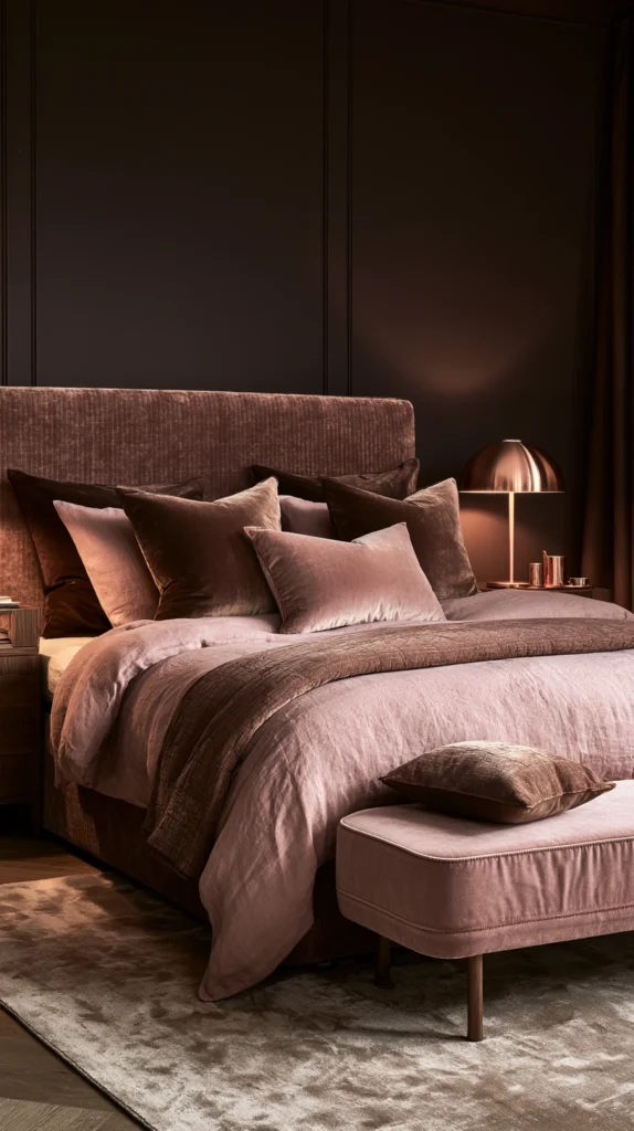
Deep, rich brown walls with unexpectedly soft pink accents — the palette that proves brown can be both moody and tender simultaneously.
Why brown deserves reconsideration:
Overcoming brown’s reputation:
- Brown is often dismissed as dated or boring in contemporary design conversations
- Deep, rich espresso brown (not the muddy, yellow-toned browns of decades past) is genuinely sophisticated
- Paired with an unexpected soft color like blush, brown becomes the backdrop for something quite romantic rather than simply earthy
Best espresso brown paints:
Wall color options:
- Benjamin Moore Dark Chocolate (2107-10)
- Sherwin-Williams Kona (SW 9108)
- Farrow and Ball Mahogany (No. 36)
- Behr Espresso Beans
The blush counterpoint:
Why pink against brown works:
- Blush has enough warmth (a peachy rather than icy undertone) to feel related to brown rather than clashing
- The combination recalls dark chocolate and rose petals, an inherently romantic visual reference
- This pairing is far less common than the cream-and-dark-wall formula, making it feel distinctive
Bedding for this palette:
Building the combination:
- Blush linen or cotton sheets and duvet cover
- A deep brown or chocolate velvet throw pillow against the blush bedding
- Warm gold or rose gold metal accents
The proportion approach:
Getting the balance right:
- Brown dominates the walls (the larger surface area)
- Blush dominates the bedding (the surface closest to the body and most visually present from the doorway)
- This division of dominance between two surfaces, rather than mixing both throughout, keeps the palette feeling intentional
Where else blush appears:
Beyond the bedding:
- A blush velvet bench at the foot of the bed
- Blush ceramic vases or small objects on the dresser
- A blush-toned lamp shade, diffusing warm light through a soft pink filter
Cost:
- Paint (full room): $80-150
- Blush bedding: $90-220
- Gold or rose gold accents: $40-100
- Total: $210-470
My espresso and blush bedroom: This was the palette I was most nervous about and ended up loving most, the deep chocolate walls with blush bedding felt like an entirely unexpected combination that nonetheless made complete sense once it was in the room together.
Espresso Brown Tips
Avoiding the muddy version:
Paint selection caution:
- Some brown paints lean too yellow or too gray, reading as dated rather than rich
- Choose browns with a slight red undertone (closer to chocolate or espresso) for the most sophisticated, fall-appropriate result
- Always sample large swatches before committing, as brown is particularly sensitive to lighting conditions
The blush quantity:
Keeping it from feeling too sweet:
- Blush should appear primarily in the bedding, not throughout every accessory
- Too much blush against the brown can tip the palette toward overly soft or sweet
- One or two blush elements against the dominant brown walls maintains the sophisticated balance this palette is aiming for
8. Deep Olive and Black (Botanical Gothic)
Muted yellow-green walls with stark black accents — the most graphically dramatic palette, referencing both nature and shadow.
Why olive and black specifically:
The combination logic:
- Olive alone can feel purely earthy and organic
- Black alone can feel purely stark and modern
- Together, they reference something specifically gothic-botanical: a greenhouse at night, dark foliage against shadow
Best olive paints:
Wall color options:
- Sherwin-Williams Oakmoss (SW 6180)
- Benjamin Moore Dried Thyme (HC-183)
- Farrow and Ball Bancha (No. 298)
- Clare Paint Wanderer
Where black appears:
Strategic placement:
- Black metal bed frame or black-framed mirror
- Black candle holders or lamp bases
- A black-and-white botanical print as the room’s primary art piece
- Black should appear as accent, not as a second wall color, in most applications of this palette
Why this combination feels gothic without being dark wall-to-wall:
The visual tension:
- Olive walls alone read as nature-forward and calming
- The introduction of stark black creates immediate visual tension and drama
- This tension is what gives the palette its specifically gothic-botanical character, rather than simply reading as a calm green room
Bedding for olive and black:
Building the look:
- Cream or warm white base bedding (the essential lightening layer, as with other palettes)
- A black velvet or black linen accent pillow
- Dried botanical elements incorporated into the room’s styling (referencing the “botanical” half of this palette’s identity)
Dried botanicals as part of the palette:
Completing the reference:
- Dried eucalyptus or preserved botanical stems in a black vase
- Pressed botanical art in black frames
- This integration of actual plant material reinforces the gothic-botanical concept beyond just paint and textiles
Cost:
- Paint (full room): $80-150
- Black accents (frame, lamp, bed frame hardware): $60-200
- Cream bedding and dried botanicals: $80-180
- Total: $220-530
My olive and black bedroom result: Sherwin-Williams Oakmoss walls with a black iron bed frame and dried eucalyptus in a black ceramic vase created the most specifically atmospheric room I have built, simultaneously calming (the green) and dramatic (the black) in a way neither color achieves alone.
Olive and Black Tips
Black as punctuation, not foundation:
The proportion rule:
- Black should appear in distinct, deliberate moments (a frame, a lamp, a bed frame) rather than throughout multiple surfaces
- Too much black against olive shifts the palette from sophisticated tension to simply dark and heavy
- Three to five black accent moments throughout the room is typically sufficient
Real versus dried botanicals:
Maintenance consideration:
- Dried botanicals require no ongoing care and fit the gothic, slightly faded aesthetic of this palette particularly well
- Fresh greenery, while beautiful, introduces a liveliness that can slightly compete with the moodier intention of this specific combination
- Dried or preserved botanical material is generally the better fit here
9. Rust and Navy (Bold Complementary Contrast)
Warm rust-orange walls with deep navy textiles — true complementary colors used boldly rather than cautiously.
Why complementary colors work despite seeming risky:
The color theory principle:
- Rust (orange family) and navy (blue family) sit roughly opposite each other on the color wheel
- Complementary colors, when one is significantly muted or darkened, create visual richness rather than clashing
- This is a more advanced palette choice but rewards the slight risk with genuine visual distinction
Best rust paints:
Wall color options:
- Sherwin-Williams Fired Brick
- Benjamin Moore Pumpkin Cream (2169-20) — slightly softer rust
- Farrow and Ball Fox Red (No. 48)
- Behr Burnished Amber
Why navy and not bright blue:
The muting requirement:
- Bright or saturated blue against rust would likely clash and feel chaotic
- Navy’s darkness and muted quality allows it to sit beside rust harmoniously rather than competitively
- This is another instance where the depth and muting of a color determines whether a bold pairing succeeds
Bedding for rust and navy:
Building the combination:
- Navy linen or cotton duvet cover against rust walls
- Rust or terracotta accent pillow against the navy duvet (echoing the wall color back into the bedding)
- Cream sheets as the neutral bridge between both bold colors
The proportion strategy:
Avoiding visual chaos:
- Walls fully committed to rust (the dominant color)
- Bedding fully committed to navy (the secondary dominant color)
- Cream sheets and minimal additional color keep the overall effect from becoming overwhelming despite two bold colors being present
Metal accents:
What works with rust and navy:
- Brass (warms the rust, provides contrast against navy)
- Aged bronze (works with both colors’ depth)
- Avoid: bright chrome or silver, which feels too cool and clinical against this warm-meets-deep combination
Cost:
- Paint (full room): $80-150
- Navy bedding: $90-220
- Brass accents: $40-100
- Total: $210-470
My rust and navy bedroom: This was the boldest palette I attempted and the one friends were most skeptical about before seeing it in person, the rust walls with a deep navy duvet cover and cream sheets created a combination that felt confident and rich rather than clashing, proving that true complementary colors can work beautifully in a bedroom when handled with the right depth and proportion.
Rust and Navy Tips
Test the pairing before painting:
Risk mitigation:
- This is the most advanced palette on this list, and testing matters more here than anywhere else
- Hold rust and navy fabric swatches together in the room’s actual light before committing to paint
- If the combination feels jarring at swatch size, it will likely feel more so at full room scale; trust this initial reaction
The cream sheet necessity:
Why this specific layer cannot be skipped:
- Without the cream sheet layer providing visual breathing room, rust and navy directly adjacent can feel more chaotic than rich
- This neutral buffer is what allows the two bold colors to coexist successfully
- Skipping this step is the most common reason this particular combination fails for people who attempt it
10. Warm Taupe and Deep Forest (Subtle Sophistication)
A warm gray-brown wall with deep forest green textiles — the most understated and versatile moody palette on this list.
Why this palette suits hesitant colorists:
The lower-risk entry point:
- Taupe is a genuinely neutral color, far less committal than the saturated walls of other palettes on this list
- This makes the palette accessible to those who want moody atmosphere without a dramatic wall color commitment
- The forest green textiles provide the depth and mood while the walls remain comparatively safe
Best warm taupe paints:
Wall color options:
- Sherwin-Williams Accessible Beige (SW 7036) — slightly lighter, very versatile
- Benjamin Moore Pale Oak (OC-20)
- Farrow and Ball Elephant’s Breath (No. 229) — has more depth and personality
- Behr Mineral
Why taupe specifically, not gray or beige:
The undertone distinction:
- True gray (cool undertone) fights against the warm forest green textiles
- True beige (often pink or yellow undertone without enough gray) can feel dated
- Taupe specifically balances both gray and warm undertones, making it the most successful neutral partner for this combination
Forest green as the depth provider:
Where forest green appears:
- Duvet cover or coverlet in deep forest green
- Velvet throw pillows
- Curtains, if the room has windows that benefit from this depth
Building the layered mood within a neutral room:
How this palette achieves moodiness despite light walls:
- The forest green textiles provide significant visual weight and depth
- Combined with warm lighting and a few additional dark accents (a black or dark wood frame, a brass lamp), the room achieves a genuinely moody atmosphere
- This proves that wall color alone is not the only path to mood; textile depth can substitute when wall commitment feels too significant
Cost:
- Paint (full room, if changing from existing neutral): $80-150
- Forest green bedding: $90-220
- Warm accents (brass, dark wood frame): $50-150
- Total: $220-520 (often less if walls are already a suitable neutral)
My taupe and forest green bedroom: This palette let me keep walls that were already a reasonable neutral and shift the entire mood of the room through forest green bedding and warmer lighting alone, proving that a complete repaint is not always necessary to achieve genuine atmospheric change.
Taupe and Forest Tips
Starting from existing walls:
The practical advantage:
- If current bedroom walls are already some shade of warm neutral, this palette may require no painting at all
- Assess existing wall color against the taupe recommendations above; many existing “greige” or warm gray walls already qualify
- This makes the palette the most affordable and lowest-effort entry point on the entire list for those not ready to commit to a dramatic wall color
Adding depth through layering, not just color:
Compensating for the lighter walls:
- Since the walls themselves are not providing dramatic depth, rely more heavily on textural layering (as established in the bedding layering article) to build mood
- Heavier curtains, more substantial throw blankets, and additional dark wood furniture pieces all contribute mood that the wall color alone is not providing
11. Black Walls and Warm Wood (Maximum Drama, Minimum Color)
True black or near-black walls paired entirely with warm natural wood tones — the most extreme version of moody on this list, executed through restraint in color but richness in material.
Why black walls work better than expected:
Overcoming the common fear:
- Most people assume black walls will feel like a cave or feel claustrophobic
- In practice, true black absorbs light so completely that the walls almost disappear into shadow, creating an unexpectedly spacious feeling at night
- During the day, with adequate natural light, black walls read as deeply sophisticated rather than oppressive
Best black paints:
Wall color options:
- Farrow and Ball Off-Black (No. 57) — slightly warmer, the most popular “black” among designers
- Benjamin Moore Wrought Iron (2124-10)
- Sherwin-Williams Tricorn Black (SW 6258)
- Behr Cracked Pepper (very dark charcoal, slightly softer alternative)
Why “off-black” rather than pure black:
The livability factor:
- Pure, true black (like a true black paint with no undertone) can feel flat and almost too stark
- A near-black with a slight warm undertone (Farrow and Ball Off-Black specifically) retains some warmth even at this extreme darkness
- This subtle warmth is what separates a sophisticated dark bedroom from one that feels like a void
Warm wood as the sole accent strategy:
The restraint principle:
- Rather than introducing multiple accent colors, this palette relies entirely on varied warm wood tones for visual interest
- Walnut, oak, teak, and reclaimed wood pieces all contribute warmth and texture against the black backdrop
- No additional accent color is needed; the wood grain and tone variation provides sufficient visual richness on its own
Bedding for black walls:
What works:
- Warm cream or natural linen bedding (essential, perhaps more critically here than in any other palette)
- No black bedding (would create an overwhelming, too-uniform darkness)
- The contrast between black walls and warm cream bedding, with wood furniture bridging the two, is the entire visual strategy
Lighting requirements:
The most demanding lighting needs on this list:
- Black walls require the most significant warm light compensation of any palette here
- Multiple lamp sources, all at the warmest available bulb temperature
- Natural light during the day should be maximized (avoid heavy curtains that block daytime light, since the walls already provide ample darkness)
Cost:
- Paint (full room): $80-150
- Warm wood furniture pieces: $200-800 (variable based on what is already owned)
- Cream linen bedding: $100-250
- Additional warm lighting: $80-180
- Total: $460-1,380 (wide range depending on furniture needs)
My black wall bedroom result: Farrow and Ball Off-Black on all four walls with a walnut bed frame, oak nightstands, and cream linen bedding created the single most dramatic room transformation I have ever achieved, and contrary to every fear I had, the room feels expansive and calm rather than confining.
Black Wall Tips
Daytime light is essential:
Balancing the darkness:
- Unlike other palettes, do not heavily curtain windows in a black-walled room
- Allow maximum natural light during the day to balance the wall’s absorption
- Reserve heavier curtains (if needed for sleep darkness) for nighttime use only, keeping them open during waking hours
Committing fully or not at all:
Why partial application rarely works here:
- A single black accent wall among otherwise pale walls in this specific palette often looks unfinished or like an unresolved design decision
- This is one of the few palettes on this list where full-room commitment genuinely outperforms a partial accent wall approach
- If full black walls feel too significant a risk, consider the charcoal palette (idea 3) as a less extreme alternative with similar mood
12. Mustard Gold and Deep Brown (Warm Earth Tone Richness)
Golden mustard walls with deep chocolate brown textiles — a warm, earthy palette that achieves moodiness through richness rather than darkness.
Why mustard for a moody bedroom:
Reconsidering mustard’s reputation:
- Mustard is sometimes dismissed as a trendy accent color rather than a serious wall color choice
- Used as a full wall color with the right brown counterpoint, mustard reads as genuinely warm, rich, and grounding
- This palette achieves mood through saturation and warmth rather than through darkness, distinguishing it from most other palettes on this list
Best mustard paints:
Wall color options:
- Farrow and Ball Babouche (No. 223) — widely regarded as one of the best mustard paints available
- Benjamin Moore Hawthorne Yellow (HC-4)
- Sherwin-Williams Harvest Gold (SW 6369)
- Clare Paint Dapper
Deep brown as the necessary depth:
Why brown specifically, not black:
- Black against mustard can feel too high-contrast and almost playful rather than moody
- Deep brown (chocolate or espresso, similar to idea 7’s recommendations) shares enough warmth with mustard to feel related rather than contrasting
- This relatedness is what allows the combination to feel rich and moody rather than bright and cheerful
Bedding for mustard and brown:
Building the combination:
- Deep brown or chocolate linen duvet cover against mustard walls
- Cream sheets as the lightening base layer
- A small amount of rust or burnt orange as a third tone, bridging mustard and brown further
Why this palette feels different from the dark-wall palettes:
The mood-without-darkness distinction:
- Most palettes on this list achieve mood through wall darkness and light absorption
- This palette achieves a similar emotional warmth and richness while keeping the walls in a mid-tone rather than dark range
- This makes it a good option for those wanting the emotional warmth of a moody bedroom without the lighting compensation challenges of true dark walls
Metal and material accents:
Completing the palette:
- Aged bronze or brass (both work well with mustard’s golden undertone)
- Warm wood furniture, particularly pieces with reddish undertones that bridge toward the brown bedding
- Woven natural textures (jute, rattan) that echo the earthy, grounded quality of the palette
Cost:
- Paint (full room): $80-150
- Brown bedding: $90-220
- Bronze or brass accents: $40-100
- Total: $210-470
My mustard and brown bedroom: Farrow and Ball Babouche walls with a deep chocolate brown duvet cover created warmth and richness without the darkness of my other moody bedroom attempts, proving that mood can come from saturation and warmth as much as from literal darkness.
Mustard Gold Tips
Managing the saturation:
Avoiding an overly bright result:
- Mustard at full saturation across all four walls is a significant commitment
- Testing large samples in the actual room is critical, as mustard can read brighter than expected once applied at scale
- Consider one accent wall first if hesitant about the full-room commitment
The brown bedding non-negotiable:
Why this specific pairing cannot be substituted:
- Mustard walls with white or cream-only bedding (no brown layer) loses much of the moody richness this palette is designed to achieve
- The deep brown specifically is what shifts mustard from “bright accent color” to “rich, grounded palette”
- This brown layer is the single most important element in making this particular combination work as intended
13. Deep Teal and Copper (Jewel Tone Modern Glamour)
Rich blue-green teal walls with warm copper metal accents — a jewel-toned palette that feels both vintage and distinctly current.
Why teal rather than navy or forest green:
The unique position teal occupies:
- Teal sits between blue and green, carrying qualities of both
- This in-between quality makes it feel less expected than either pure navy or pure forest green
- The result is a jewel tone that feels fresh rather than overused in current design conversations
Best teal paints:
Wall color options:
- Sherwin-Williams Oceanside (SW 6496)
- Benjamin Moore Teal (2053-20)
- Farrow and Ball Vardo (No. 288) — slightly more muted and sophisticated
- Behr Jazz Age
Copper as the specifically warm metal choice:
Why copper over brass or gold here:
- Copper has a distinctly warm, reddish-orange undertone that activates beautifully against teal’s blue-green coolness
- This is a true complementary pairing (teal and copper sit roughly opposite on the color wheel), creating genuine visual richness
- Copper’s slightly more unusual and vintage association also suits this jewel-tone palette’s overall character
Where copper appears:
Building the metal accent story:
- Copper lamp bases or pendant lighting
- Copper-rimmed mirror
- Copper drawer pulls or cabinet hardware
- A copper vessel or vase on the dresser
Bedding for teal and copper:
Color choices:
- Cream or warm ivory base bedding
- A teal velvet accent pillow (echoing the wall color back into the textiles)
- A small rust or copper-toned accent pillow for additional warmth
The vintage-modern balance:
Why this palette feels current despite jewel-tone associations:
- Jewel tones can sometimes feel dated if paired with the wrong materials (heavy brocade, ornate gold)
- Pairing teal specifically with clean-lined furniture and copper’s more industrial-adjacent warmth keeps the overall feeling modern
- This is a palette that bridges vintage glamour and contemporary design sensibility
Cost:
- Paint (full room): $80-150
- Copper accents (lighting, hardware, vessel): $60-180
- Teal and rust bedding accents: $60-110
- Total: $200-440
My teal and copper bedroom: Sherwin-Williams Oceanside walls with a copper pendant light and copper-rimmed mirror created a jewel-toned bedroom that felt simultaneously like a vintage parlor and a current, well-considered modern space.
Teal and Copper Tips
Patina versus polished copper:
Choosing the right finish:
- Polished copper provides brighter, more immediate visual warmth
- Patinated (aged, slightly green-brown toned) copper provides a more subtle, antique character
- Both work; the choice depends on whether the room should feel more glamorous (polished) or more vintage and lived-in (patinated)
Avoiding an overly nautical reading:
Style discipline:
- Teal can sometimes drift toward a coastal or nautical association if paired with the wrong accessories
- Avoid rope details, anchors, or overly literal beach references
- Copper, clean furniture lines, and jewel-toned textiles keep the palette in its intended glamorous-vintage territory rather than slipping into coastal cliché
14. Slate Blue-Gray and Rust (Stormy Sky Meets Warm Earth)
A cool, stormy blue-gray wall paired deliberately with warm rust accents — proving that a cool-toned wall can still anchor a genuinely warm, moody bedroom.
Why pair a cool wall with warm accents intentionally:
The deliberate tension principle:
- Most palettes on this list use a warm wall with warm accents, or a cool wall with cool accents
- This palette deliberately creates tension: a cool, moody slate wall grounded by determinedly warm rust textiles
- The result is a room that feels complex and considered rather than simply matched
Best slate blue-gray paints:
Wall color options:
- Farrow and Ball Down Pipe (No. 26) — has both blue and warm undertones depending on light
- Benjamin Moore Stormy Sky (1632)
- Sherwin-Williams Slate Tile (SW 9619)
- Behr Cracked Pepper (also referenced in the black wall palette, slightly more blue in some lighting)
Why this specific cool-warm tension works:
The compensation principle:
- A cool wall alone, with cool or neutral accents, can feel genuinely cold and uninviting in a bedroom
- Introducing strongly warm rust accents specifically compensates for and balances the coolness of the wall
- This is different from simply choosing a warm wall to begin with; it allows for a specific blue-gray that some people are drawn to, while still achieving overall warmth through accent strategy
Rust as the warming counterbalance:
Where rust appears:
- Rust velvet duvet cover or substantial accent pillow
- A rust leather chair or bench
- Warm wood furniture with reddish undertones (cherry, mahogany) that echo the rust tone
Bedding for this palette:
Building the deliberate contrast:
- Rust as the dominant bedding color (not cream, in this specific case, since the rust itself needs to do significant warming work)
- A cream or oat sheet layer underneath for breathing room
- Brass metal accents (warm, bridges both the cool wall and warm bedding)
Lighting compensation:
Why this palette needs careful attention to bulb warmth:
- Similar to the midnight blue palette (idea 6), a cool-toned wall requires more deliberate warm light compensation
- The rust bedding helps significantly, but warm bulbs throughout remain essential
- This is not a palette to attempt with cooler-temperature bulbs; the entire balance depends on warm light support
Cost:
- Paint (full room): $80-150
- Rust bedding (substantial, as the dominant warming element): $100-250
- Brass accents and warm wood furniture: $60-200
- Total: $240-600
My slate and rust bedroom: This was the palette that taught me a cool wall does not automatically mean a cold room, the Down Pipe walls paired with a rust velvet duvet and brass lamp created a deliberately balanced tension between cool and warm that felt more sophisticated than a fully warm or fully cool room would have.
Slate and Rust Tips
The accent weight must be significant:
Why a small rust accent is insufficient here:
- Unlike palettes where a small accent pillow provides sufficient warmth, this combination requires the rust to carry substantial visual weight
- A full rust duvet cover, not just a single pillow, is necessary to properly balance the cool wall
- Underestimating the required warmth here is the most common reason this specific combination fails to achieve its intended balance
Testing the specific Down Pipe-type colors carefully:
The dual-undertone consideration:
- Some blue-gray paints, including Farrow and Ball Down Pipe specifically, shift noticeably between warm and cool depending on the light
- This can work in this palette’s favor (some warmth already present) or against it (if the room’s light brings out an overly cool cast)
- Sample extensively in the specific room’s lighting before committing, more so than with most other paints on this list
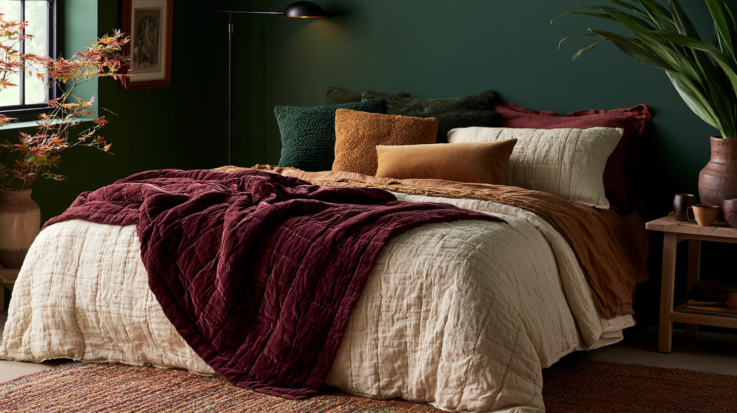
15. Deep Forest, Burgundy, and Brass (The Full Maximalist Moody Palette)
Combining the richest elements from multiple palettes into one fully layered, maximalist moody bedroom — for those ready to commit to the most complete transformation on this list.
Why combine rather than choose just one:
The maximalist philosophy:
- Several of the palettes on this list (hunter green, burgundy, brass accents) share enough underlying warmth and depth to combine successfully
- Rather than choosing a single dominant color, this approach layers multiple rich, moody tones together
- This is the most advanced and most visually abundant palette on this list, suited to those who want maximum atmosphere
The combined color strategy:
How the three elements work together:
Forest green (the wall foundation):
- Provides the calming, enveloping base established in idea 1
- The most neutral of the three rich colors, allowing it to serve as the foundation
Burgundy (the textile depth):
- Introduced through bedding, curtains, or a substantial accent chair
- Provides richness and romance without needing to compete with the green walls
Brass (the unifying metal):
- Ties both the green and burgundy together
- Appears throughout: lighting, frames, hardware, candle holders
Why these three specifically harmonize:
The underlying logic:
- All three colors share a similar depth and warmth level (none of them are bright or light)
- Forest green and burgundy are both found together in traditional, classic interior references (think old hunting lodges, classic libraries)
- Brass has historically been paired with both colors independently, making it a natural unifying thread
Building the full maximalist room:
Layer by layer:
Walls:
- Forest green (full room, as established in idea 1’s recommendations)
Bedding:
- A burgundy velvet duvet cover or substantial burgundy coverlet
- Cream sheets underneath for breathing room
- A forest green velvet accent pillow (bringing the wall color back into the bedding)
Furniture and accents:
- Brass lamp bases on both nightstands
- A burgundy or forest green velvet bench at the foot of the bed
- Brass picture frames throughout any wall art
- Dark wood furniture (walnut specifically) bridging both colors
Textural abundance:
Why this palette can support more layering than others:
- Because all three core elements (green, burgundy, brass) are unified in tone and warmth, additional textural layers (a striped wool blanket, a faux fur throw, vintage objects) can be added without creating visual chaos
- This is the one palette on this list specifically suited to the full layered bedding and decor approach covered in companion articles on fall bedroom styling
Lighting for the full maximalist room:
Bringing it all together:
- Multiple brass lamp sources (more than the single-element palettes, given the room’s overall richness)
- Warm bulbs throughout (2200-2700K, consistent with every other palette on this list)
- Candlelight in the evening, specifically interacting beautifully with both the green walls and the brass accents
Cost:
- Paint (full room): $80-150
- Burgundy bedding and accent furniture: $150-400
- Brass accents throughout (multiple pieces): $100-300
- Additional textural layers: $80-200
- Total: $410-1,050
My full maximalist moody bedroom result: Combining forest green walls with a burgundy velvet bench, cream and burgundy bedding, and brass lamps and frames throughout created the single richest, most atmospheric room in my entire home, and because every element shared the same underlying warmth, nothing about the abundance felt chaotic or overdone.
Maximalist Combination Tips
Establish the wall first, then layer in:
The sequencing principle:
- Paint the forest green walls and live with them for at least a week before adding the burgundy and brass elements
- This staged approach lets you assess how much additional richness the room can handle before committing to the full layered look
- Some rooms, depending on size and light, may call for slightly less burgundy or brass than initially planned
This palette is not for every room:
Honest sizing consideration:
- This level of richness and layering works best in a room with adequate space; a very small bedroom may feel overwhelmed by this much depth and texture
- For smaller rooms, consider choosing just two of the three elements (forest green walls and brass accents, without the additional burgundy layer) for a slightly more restrained version of this same general direction
Choosing Your Moody Palette
By commitment level:
Lower commitment (accent wall or textile-led):
- Warm taupe and deep forest (idea 10): minimal wall change, mood through textiles
- Burgundy and cream (idea 2): can start with a single accent wall
Full room commitment:
- Hunter green and brass (idea 1)
- Black walls and warm wood (idea 11)
- Midnight blue and antique brass (idea 6)
Maximum transformation:
- Deep forest, burgundy, and brass (idea 15): the complete maximalist approach
By existing furniture and undertones:
With dark wood furniture already:
- Burgundy and cream (idea 2)
- Espresso brown and soft blush (idea 7)
- Deep forest, burgundy, and brass (idea 15)
With lighter or blonde wood furniture:
- Charcoal and warm caramel (idea 3)
- Black walls and warm wood (idea 11, if updating to walnut pieces)
With existing metal finishes:
If keeping existing brass fixtures:
- Hunter green and aged brass (idea 1)
- Midnight blue and antique brass (idea 6)
- Mustard gold and deep brown (idea 12)
If keeping existing black or dark iron fixtures:
- Deep olive and black (idea 8)
- Charcoal and warm caramel (idea 3)
By desired emotional tone:
Calm and restful:
- Hunter green and aged brass (idea 1)
- Warm taupe and deep forest (idea 10)
Romantic and intimate:
- Burgundy and cream (idea 2)
- Espresso brown and soft blush (idea 7)
Dramatic and bold:
- Black walls and warm wood (idea 11)
- Rust and navy (idea 9)
- Deep forest, burgundy, and brass (idea 15)
Distinctive and unexpected:
- Deep plum and warm gold (idea 4)
- Slate blue-gray and rust (idea 14)
- Deep teal and copper (idea 13)
The Undertone Verification Process
Why this matters across every palette on this list:
The universal first step:
- Before painting any wall in any of these fifteen palettes, verify the paint’s undertone in the room’s actual light
- Hold the chosen accent material (brass, wood, fabric) against the paint chip in both daylight and lamp light
- This single verification step prevents the majority of moody palette failures, regardless of which specific combination is chosen
The light testing protocol:
A consistent method across all fifteen palettes:
- Purchase a sample pot of the chosen wall color
- Paint a section at least two feet square on the actual wall
- Observe at morning, midday, and evening, with the lamps that will actually be used in the finished room
- Confirm the accent metal and key textile colors against this sample before finalizing any purchases
Maintenance and Longevity
Caring for moody palettes over time:
Paint maintenance:
- Dark walls show scuffs and marks more visibly in some lighting than light walls
- Keep a small amount of touch-up paint on hand
- Matte finishes (recommended throughout this list) are more prone to visible marks than higher sheens, but also more visually appropriate for the moody aesthetic
Textile care:
Maintaining velvet, wool, and other rich textiles:
- Refer to the layered bedding article for specific care of velvet, wool, and faux fur elements used throughout these palettes
- Brass and copper accents benefit from occasional polishing or, alternatively, embracing the natural patina that develops over time
Seasonal flexibility:
Beyond just fall:
- Most of these palettes, because they rely on wall color and furniture rather than purely seasonal decor, work well beyond autumn into winter
- Only the lighter bedding layers (per the companion bedding article) need seasonal adjustment; the wall color and core palette can remain consistent year-round
My Complete Palette Journey
Three bedrooms, three different palettes, across several years:
Bedroom one:
- Hunter green and aged brass (idea 1)
- The first moody palette attempted, taught the importance of warm lighting compensation
- Total cost: approximately $400
Bedroom two:
- Charcoal and warm caramel (idea 3)
- A more minimalist approach after learning that abundance is not required for mood
- Total cost: approximately $350
Bedroom three (current):
- Deep forest, burgundy, and brass (idea 15)
- The full maximalist combination, built after gaining confidence with the simpler palettes
- Total cost: approximately $650
The progression lesson:
- Starting with a single, well-executed palette before attempting the maximalist combination allowed each subsequent room to be built with more confidence and fewer corrections
- The undertone verification process became faster and more intuitive with each attempt
Getting Started This Weekend
Choose based on commitment level, not just aesthetic preference.
This weekend:
Step 1 — Assess your actual willingness to repaint:
- If hesitant about a full repaint, start with idea 10 (warm taupe and deep forest) or a single accent wall approach
- If ready for full commitment, choose from the more saturated options based on the emotional tone desired
Step 2 — Verify undertones before buying paint:
- Follow the testing protocol outlined above
- This single step prevents the most common and costly mistakes across every palette on this list
Step 3 — Plan the lighting alongside the paint:
- Every palette on this list requires warm bulb compensation
- Budget for this lighting change at the same time as the paint, not as an afterthought discovered later
My recommendation:
For a first attempt at a moody bedroom, start with idea 1 (hunter green and aged brass) or idea 3 (charcoal and warm caramel): both are forgiving of minor undertone variation, both pair well with furniture most people already own, and both deliver dramatic mood without the more advanced color-pairing risk of palettes like rust and navy or slate and rust.
Now go choose the moody palette that will finally make your bedroom feel like it belongs to the season.
Quick Summary
The 15 moody fall bedroom palettes:
Calm and enveloping:
- Hunter green and aged brass (idea 1): the library bedroom
- Warm taupe and deep forest (idea 10): subtle sophistication, lower commitment
Romantic and intimate:
- Burgundy and cream (idea 2): the romantic wine cellar
- Espresso brown and soft blush (idea 7): warmth meets romance
Modern and minimal:
- Charcoal and warm caramel (idea 3): modern moody minimalism
- Black walls and warm wood (idea 11): maximum drama through restraint
Distinctive and unexpected:
- Deep plum and warm gold (idea 4): unexpected jewel tone luxury
- Deep teal and copper (idea 13): jewel tone modern glamour
- Slate blue-gray and rust (idea 14): stormy sky meets warm earth
Earthy and grounded:
- Terracotta and charcoal (idea 5): earthy drama
- Deep olive and black (idea 8): botanical gothic
- Mustard gold and deep brown (idea 12): warm earth tone richness
Bold and dramatic:
- Midnight blue and antique brass (idea 6): the starry night bedroom
- Rust and navy (idea 9): bold complementary contrast
Maximum transformation:
- Deep forest, burgundy, and brass (idea 15): the full maximalist combination
The non-negotiable rules across every palette:
Always:
- Verify the wall paint’s undertone against key accent materials before committing
- Compensate dark or cool walls with significantly increased warm lamp lighting (2200-2700K)
- Include at least one light, warm neutral layer (cream or ivory) in the bedding to balance dark or saturated walls
- Test paint samples at multiple times of day and under the actual lamps that will be used
Never:
- Pair a moody wall color with bright white bedding (too stark a contrast in most cases)
- Use cool-temperature light bulbs in any of these palettes
- Assume a single accent pillow can substitute for full bedding commitment to the secondary palette color
- Skip the undertone verification step, regardless of how confident the color choice feels
Choosing by risk tolerance:
Lowest risk: Warm taupe and deep forest (idea 10), Hunter green and aged brass (idea 1) Moderate risk: Burgundy and cream (idea 2), Charcoal and warm caramel (idea 3), Terracotta and charcoal (idea 5) Higher risk, higher reward: Rust and navy (idea 9), Slate blue-gray and rust (idea 14), Deep plum and warm gold (idea 4) Maximum commitment: Black walls and warm wood (idea 11), Deep forest, burgundy, and brass (idea 15)
Common mistakes:
- Choosing a dark or saturated wall color without planning for significantly increased warm lighting
- Skipping the undertone test and discovering a clash only after painting the full room
- Using a small accent pillow to represent an entire secondary palette color rather than committing that color to the bedding more substantially
- Pairing cool-toned walls with cool-toned metals (compounding rather than balancing the coolness)
- Attempting the most advanced complementary palettes (rust and navy, slate and rust) as a first moody bedroom attempt without the undertone testing experience built from a simpler palette first
- Forgetting that a moody palette is a complete system, not a wall color choice made in isolation from bedding and lighting decisions
Remember: Every palette on this list depends on the relationship between wall color, bedding, and light working together, not any single element in isolation, the undertone verification process matters more than the specific color chosen and prevents the majority of failed attempts, warm light compensation is non-negotiable for every dark or cool-toned wall on this list, starting with a more forgiving palette before attempting an advanced complementary pairing builds the confidence and undertone-reading skill needed for the bolder choices, and the goal of every palette here is the same: a bedroom that feels different, deeper, and more enveloping than it did before, regardless of which specific colors get you there.